Revolutionary Product Design for Walmart

Project Overview:
Lucent Trans is a manufacturer of mobile accessories, including chargers, cables, power banks, and other consumer electronics. As a product designer, one of my primary responsibilities was to develop and present new product concepts for Walmart's buying trips, where suppliers compete for retail placement.
Introduction
With a product portfolio of more than 100 car and wall charger models, creating new designs required balancing innovation, market trends, manufacturing feasibility, and Walmart's retail requirements. In the following sections, I will showcase my design work and walk through my design and thinking process throughout the product development cycle.
Team
1 Mechanical Engineer • 1 Industrial Designer • 1 Product Designer(Me) • 1 Project Manager
Tool
Adobe Illustrator, Maya, KeyShot, Pro/E.
Development Time
8 months
Design Objectives
The goal of this project was to develop and present a new series of product concepts for Walmart's buying trip. Our team needed to create compelling, market-ready designs that would impress Walmart's buyers and secure the opportunity to bring these products to retail.
As the largest retailer in the United States, Walmart generated approximately $15.9 billion in annual net income in 2014 and represented one of our company's most important strategic partners. As one of Walmart's largest mobile accessory suppliers, we worked closely with their buying team to understand market trends, consumer preferences, and retail expectations. Every new product proposal needed to demonstrate innovation, commercial viability, and strong visual appeal in order to win the bid.

Design Challenges
Coordinating closely with mechanical engineers to ensure the industrial design aligned with engineering constraints, manufacturing feasibility, and performance requirements.
Exploring and refining key design elements, including the charging interface, form factor, color palette, electrical contact design, LED indicators, material selection, surface finishes, and the placement of logos and regulatory markings.
Researching how consumers use car chargers compared to wall chargers to identify unmet needs and opportunities for product differentiation.
Evaluating existing products on the market to understand industry trends, strengths, weaknesses, and opportunities for innovation.
Identifying customer preferences, pain points, and expectations to guide design decisions.
Exploring new ways for users to operate and interact with the product, with the goal of creating a more intuitive and engaging user experience.
Success Metrics
All 10 user testers responded positively to the redesigned product. The new appearance and enhanced user experience impressed both the CEO and the project manager, contributing to a 30% salary increase.
Research Phase
To begin the project, I conducted a comprehensive review of the company's existing charging products. I analyzed previous generations of car chargers to identify their key features, design language, and points of differentiation. This research helped me understand the company's design history while revealing opportunities for innovation.
I broke down each product into its core design components and evaluated which elements could be refined or reimagined to create a new product line.
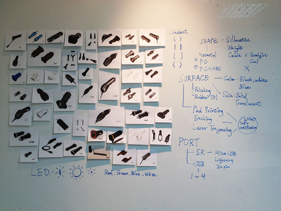
Shape
I examined the overall form of each charger, exploring how changes to the silhouette, curves, and surface lines could create a more modern and recognizable appearance.
Color
Most existing car chargers were available in black or white. I explored alternative color palettes and accent colors that could help distinguish new products while remaining appropriate for the consumer electronics market.
Electrical Contact Plate
I studied the different contact plate designs used to establish electrical connections inside the vehicle's power outlet, evaluating their functionality, reliability, and manufacturing considerations.
Surface Finish
Previous products featured a variety of finishes, including glossy, matte, soft-touch rubber, and silky-textured plastics. I assessed how each finish influenced the product's tactile experience, perceived quality, and visual appeal.
Charging Configuration
I compared different charging solutions, including integrated cables (coiled/standard) and open USB ports. Existing products ranged from one to four USB ports and supported various connector types, including Apple's legacy 30-pin connector (iPhone 3/3GS/4/4S), Lightning connectors (iPhone 5 and later), and Micro-USB for Android devices.
LED Indicator
I reviewed the LED indicator designs used across previous models, including different colors (red, green, blue, and white) as well as various shapes such as circular, oval, and ring-style indicators. These elements contributed to both usability and product identity.
Branding and Product Markings
I analyzed how branding, specifications, and regulatory information were applied using different manufacturing techniques, including laser engraving, etching, and pad printing. Each method affected the product's durability, readability, production cost, and overall aesthetic.
Functionality
Another critical aspect of the design process was defining the product's electrical specifications. I needed to determine the appropriate output voltage and charging performance targets, as these directly influenced the selection of the internal charging chipset and circuit design.
The electrical specifications also affected the product's compatibility with different mobile devices, charging speed, power efficiency, thermal performance, and manufacturing cost. Balancing these technical requirements with user expectations and market trends was essential to creating a competitive product.
Solution
The typical workflow for using a car charger is straightforward: the user inserts the charger into the vehicle's power socket, establishing an electrical connection, and then connects a charging cable to their mobile device. While the charging technology itself had evolved significantly, the physical interaction between the user's hand and the charger had remained largely unchanged for years.
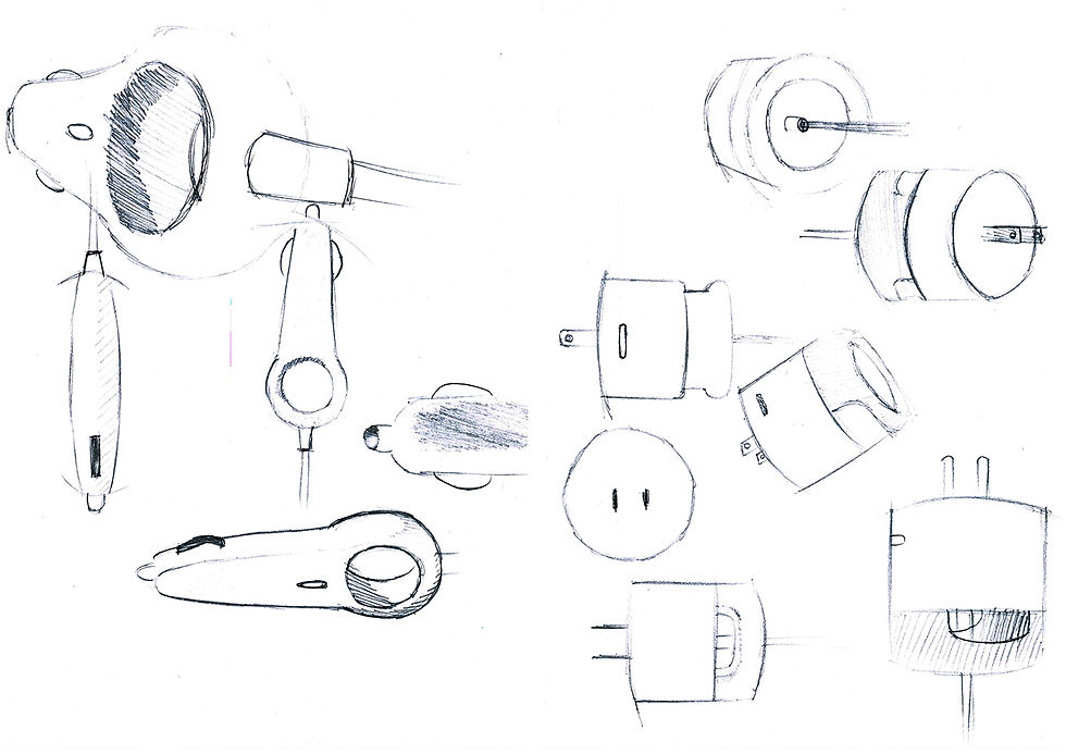
I identified this overlooked touchpoint as an opportunity for innovation. Rather than focusing solely on electrical performance, I sought to improve the overall user experience by redesigning how users grip, insert, and remove the charger.
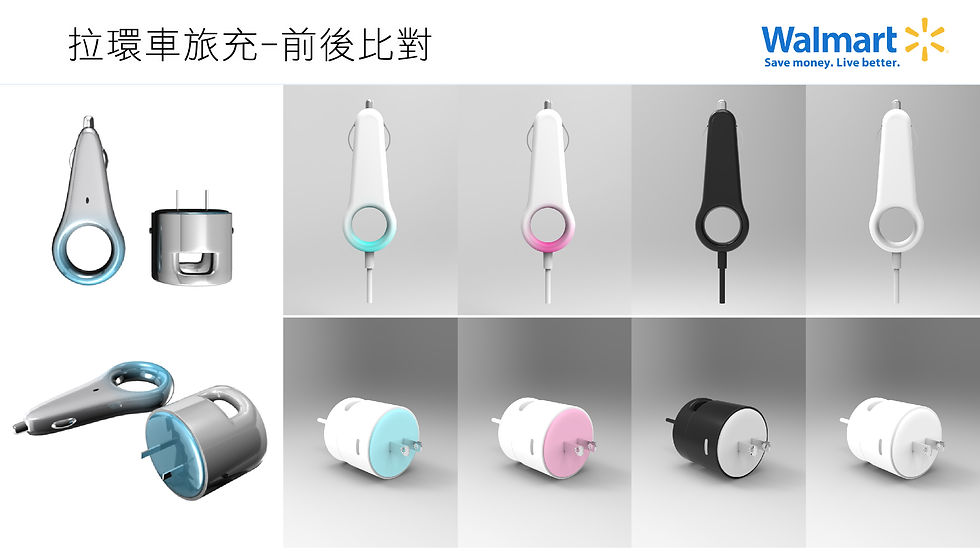
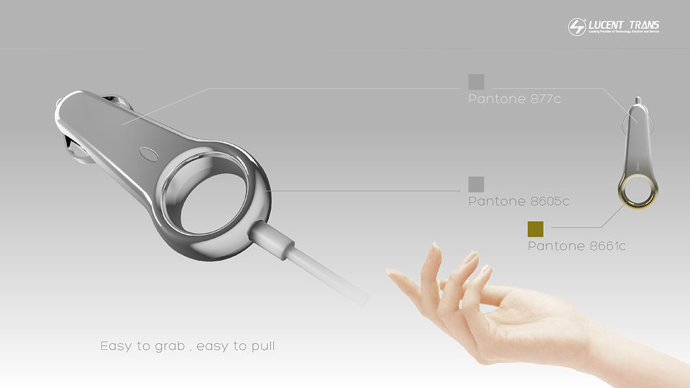
My solution introduced a distinctive integrated pull ring into the product's form. The ring provides a more ergonomic grip, allowing users to insert and remove the charger effortlessly, especially in confined vehicle interiors where traditional chargers can be difficult to grasp. This simple addition transformed an everyday interaction into a more intuitive and user-friendly experience while also giving the product a recognizable visual identity.
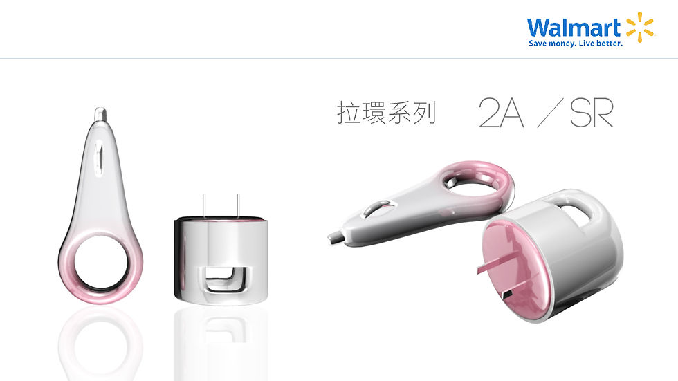
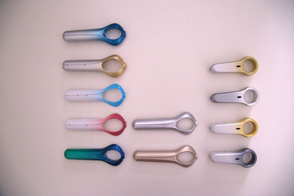
To further differentiate the design, I paired the new form with a gradient surface finish that enhanced both the product's aesthetics and perceived quality. Together, the ergonomic pull ring and refined surface treatment modernized a product category whose physical interaction had been largely overlooked, creating a charger that was not only functional but also more enjoyable to use.

Prototype
We spent a month experimenting with different color palettes and gradient treatments to achieve the optimal visual appearance.
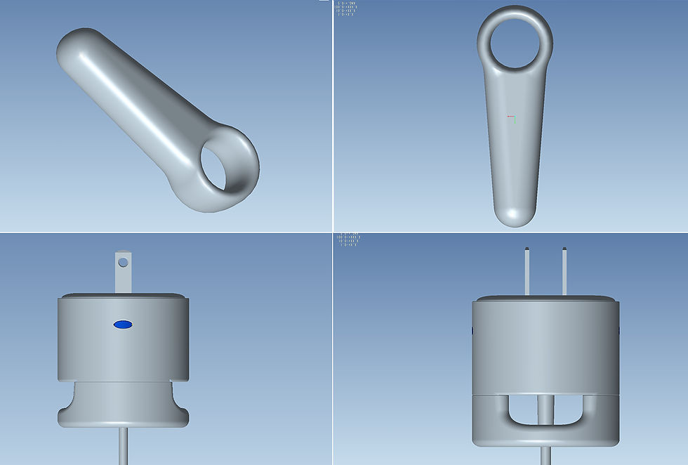
Packaging
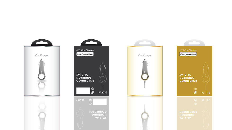
To distinguish our products from competing brands, I moved away from the conventional packaging color schemes commonly seen in the mobile accessories market. Instead, I developed a premium visual identity centered around metallic gold and silver finishes, conveying a sense of sophistication and high-end quality.
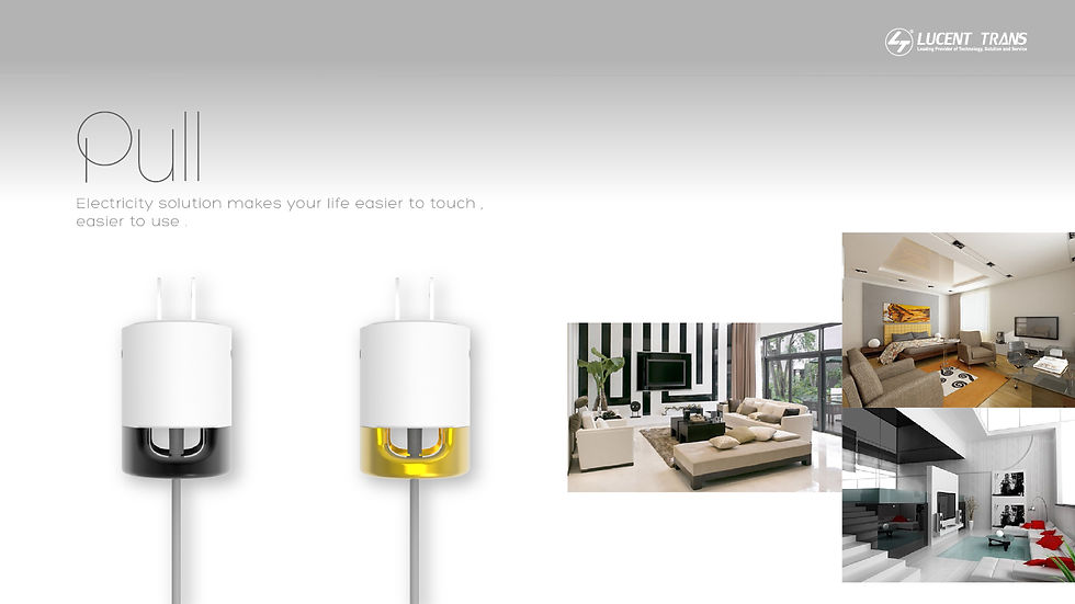
This design language extended beyond the packaging to the products themselves. I introduced a gradient finish on the chargers, creating a cohesive look between the product and its packaging while enhancing the perceived value of the entire product line. The combination of metallic colors, refined graphics, and premium surface treatment helped position the chargers as more elegant and desirable than competing products on retail shelves.
Result



Comments